
The Power of the Right Paint Color in a North Facing Room: How Painting Our Bungalow Dining Room a Bold Blue Instantly Increased the Charm

Here she is, our dining room all done up in blue! Deeply saturated with green undertones, some might call it teal, but I don’t think that’s quite right. What is right is what the color – Amidship from HGTV HOME by Sherwin Williams – has done for the room.


The truth is, this was not the first time I’d painted this room. North-facing rooms are tough to get right. They only receive indirect sunlight so they’re often the darkest room in the house. The light they do receive can feel a bit grey and dull.
Here’s what it looked like before:
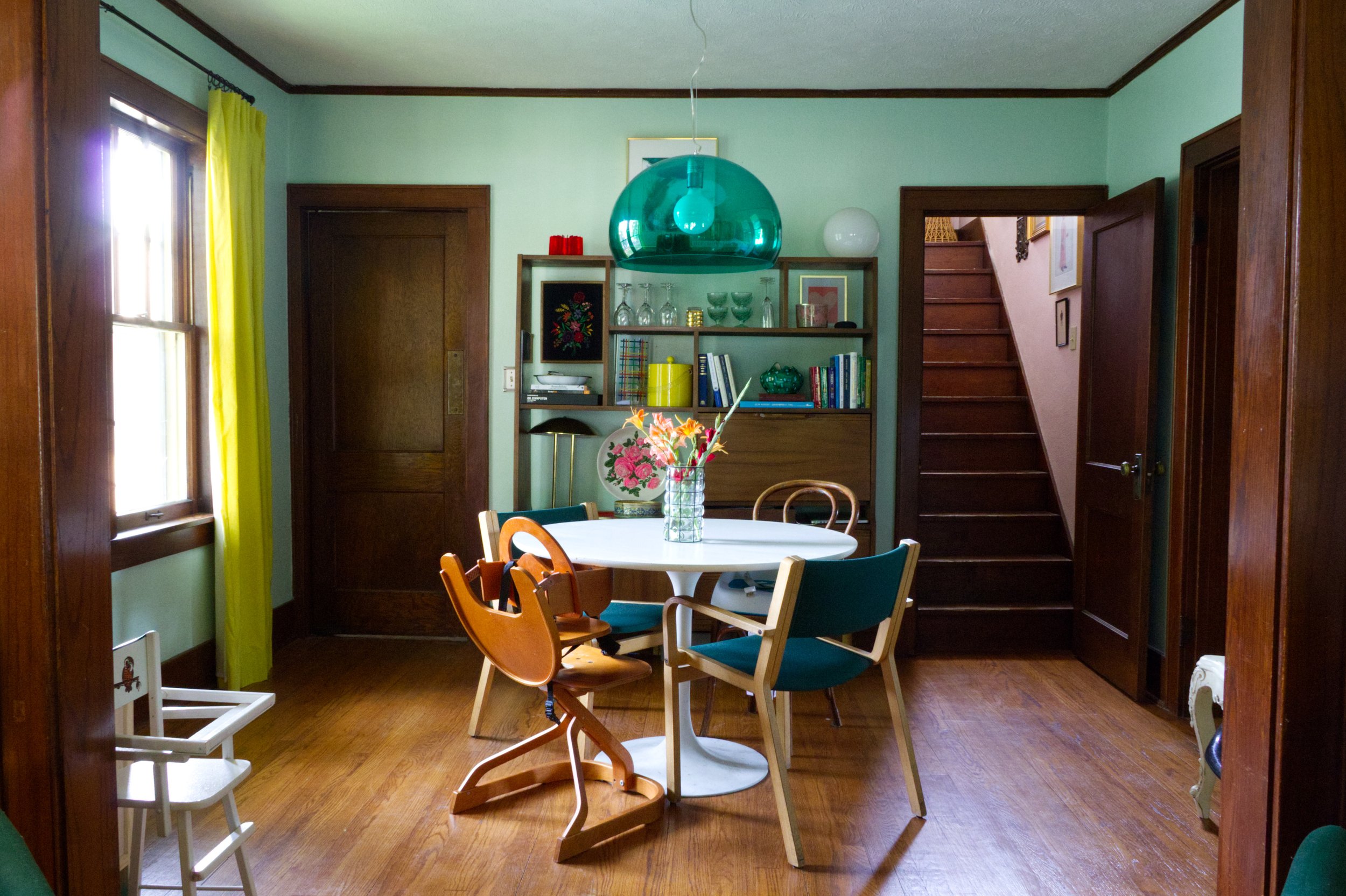
I mean, it’s not just me, right? You see it too? In this room the mint paint on the walls, normally a fresh and light-hearted color, loses all of it’s levity. It’s like when people get their “colors done” and stop wearing muted mustards/dusty pinks in favor of a bold coral, or luscious jewel tone. This room got its colors done and discovered deeply saturated was its calling all along.

Funnily enough I’d forgotten I’d already employed this wizardry in another north-facing room years before – Sensual Jade on the walls of the Grown-Up Bohemian Dining Room. It worked just the same. So I think we can all agree the lesson is stop being boring; go bold.
Or, you know, something like that.
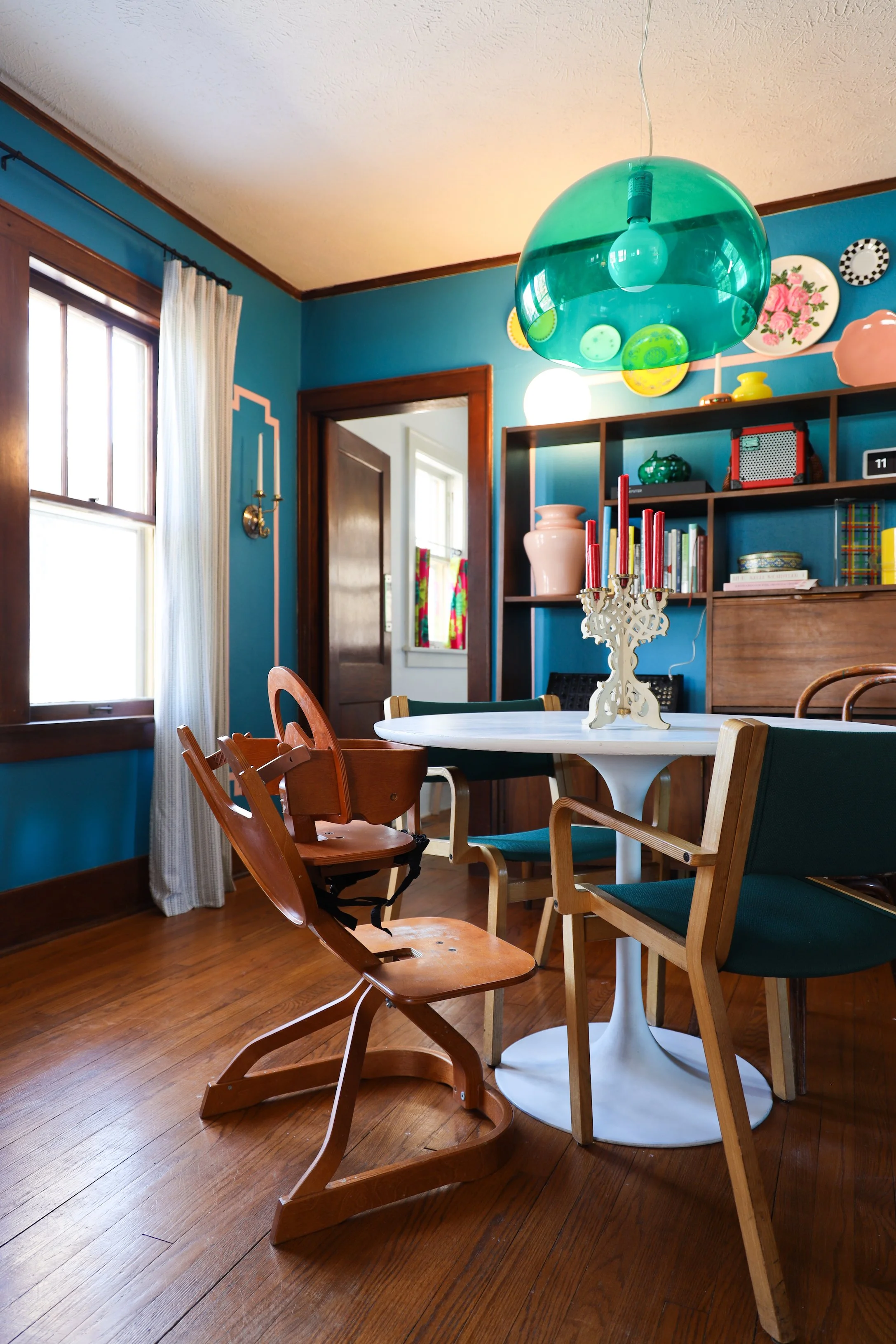
Once I had the right color on the walls, I did that “it’s good, but I feel like it could be better” thing and asked myself the age-old adage, “What Would Wes Anderson Do?” Answer: Faux painted molding in pink. I have no misconceptions that my 1920s bungalow is somehow passing as a neoclassical victorian, no, I just like the quirkiness of the mix.


Decorating the space above the hutch has often eluded me. It’s so focal, but the green pendant makes most things I’ve placed back there feel like they’re competing for attention.

Solution: plate wall, but make it mod.
I decided to try my hand at installing the assortment of colorful, kitschy plates I’ve thrifted over the years. To play nicely with the light fixture I attached them in an organic arrangement, this way they appear to float harmoniously around the pendant.


This corner continues to evolve as musical equipment rotates in and out. For now, it’s filled with one of Luke’s many superfluous synthesizers (my words, not his). It’s great for post dinner sing-a-longs – ok, fine, that doesn’t actually happen, but it could, and that’s the dream.

Is Beatrix wearing a helmet indoors? Yes, yes she is. Honestly, because she rules so bad.

So in summation, paint is hard. North-facing rooms are hard. Don’t get too bent up if you get it wrong the first try. Bold, saturated colors are your friend.
And WWWAD?

Be bold, not boring, my friend!

Photography: (“After” images) Bethany Gilbert